Cue for Education
- Platform: Web: Chromebook and Win10 laptops
- Url: https://code.makewonder.com/cue/
Overview
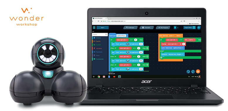
Targeted for middle school students, Cue for Education is a classroom optimized experience made for teachers and students using Chromebook and Win10 laptops. The product is a spinoff of the first Cue app developed for home use on phones and tablets.
There are two main features/coding paradigms;
• Create: node based state machine programming editor.• Code: block to text based coding editor based on the Microsoft Makecode.com framework.
We have wrapped a content system around these two coding environments consisting of a challenges & examples. This is our first product to have an account system that allows all users to save their programs to the cloud and also permits teacher and student accounts to be linked together.
Problem to solve
The current Cue app needs to be adapted for classrooms, teachers and students.
Through focus group sessions with middle school teachers and feedback from those using the current home app we established the following;
• Middle school students are using Chromebook or Win10 laptops, not tablets.• Device sharing is a necessity. (One robot for multiple students & multiple students using the same Chromebook)
• Cloud based saving of programs and content progression is vital.
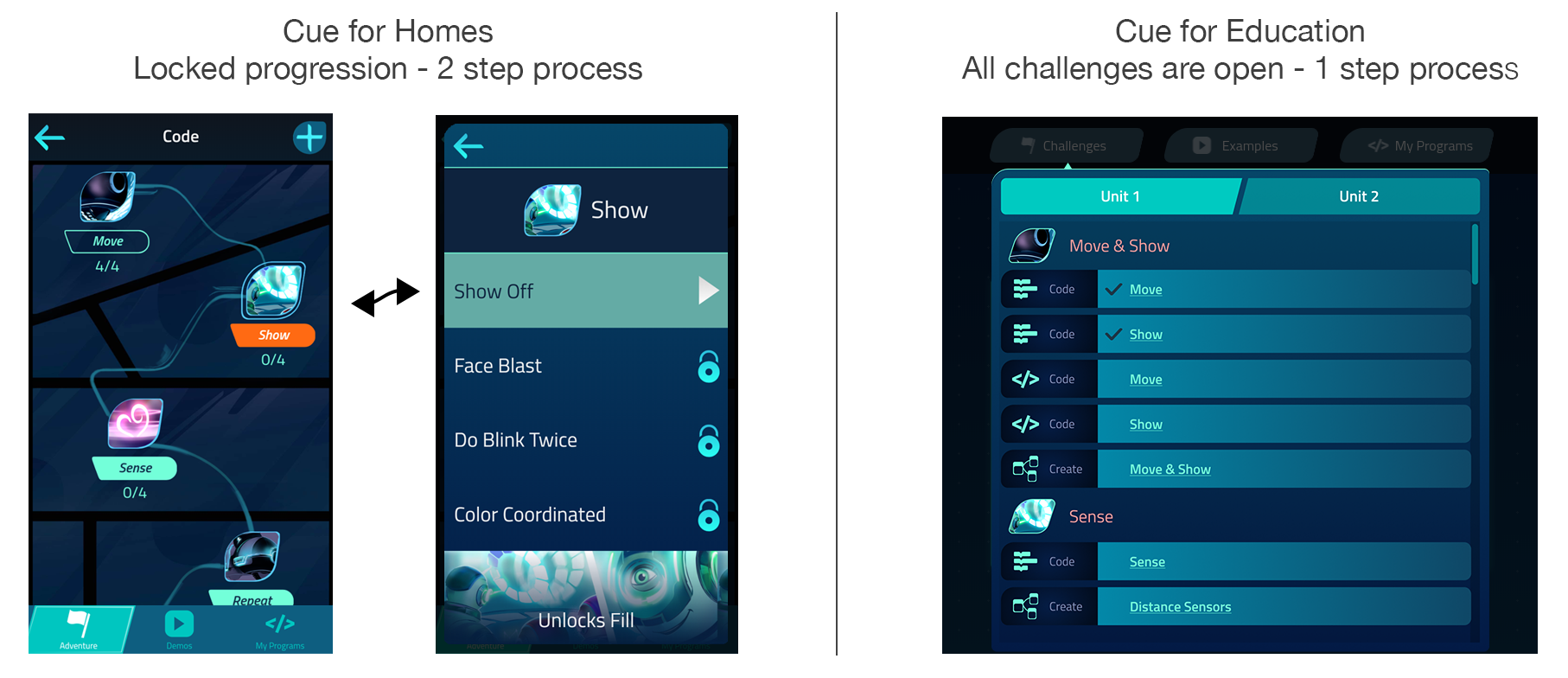
• Teachers do not want a locked progression type of content system. They wish to pick and choose freely.
• I do not want to have to create an account.
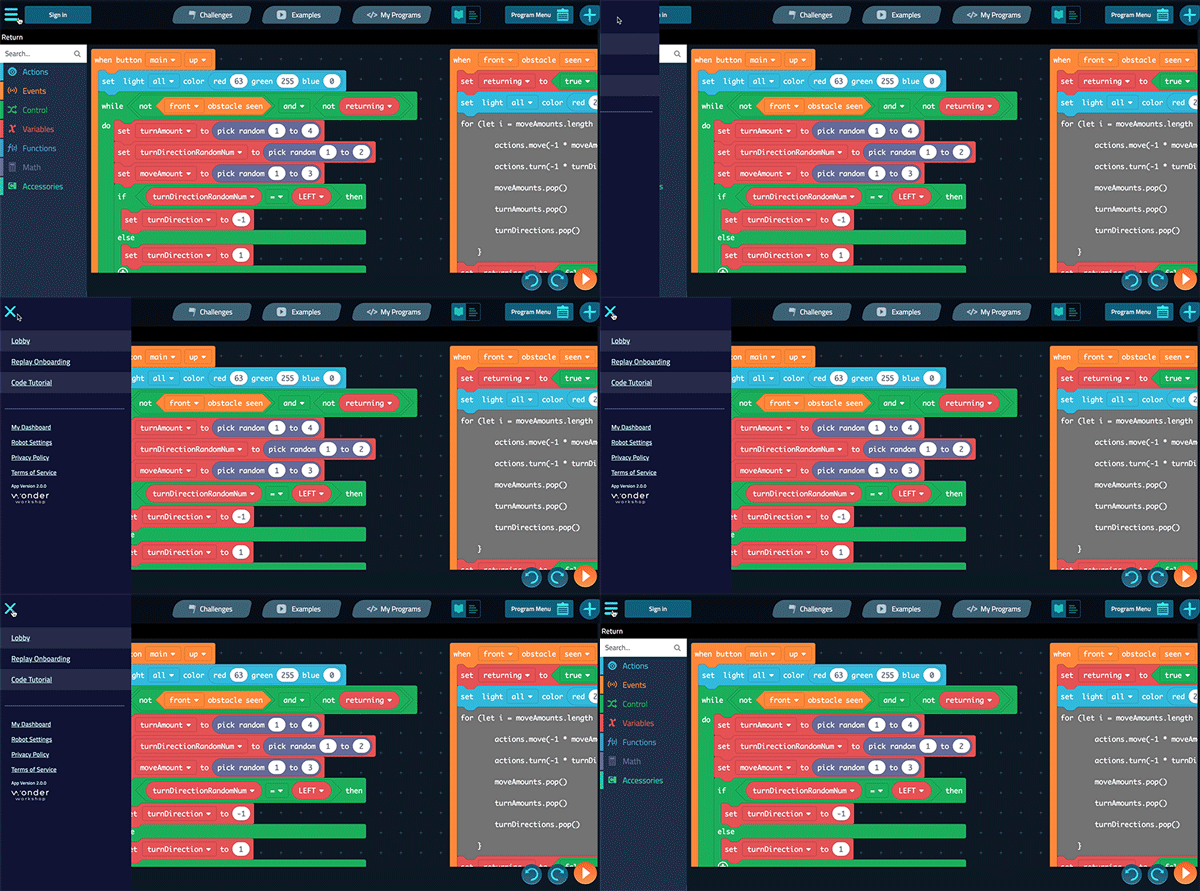
• I want to be able to skip the tutorials.
Main navigation flow
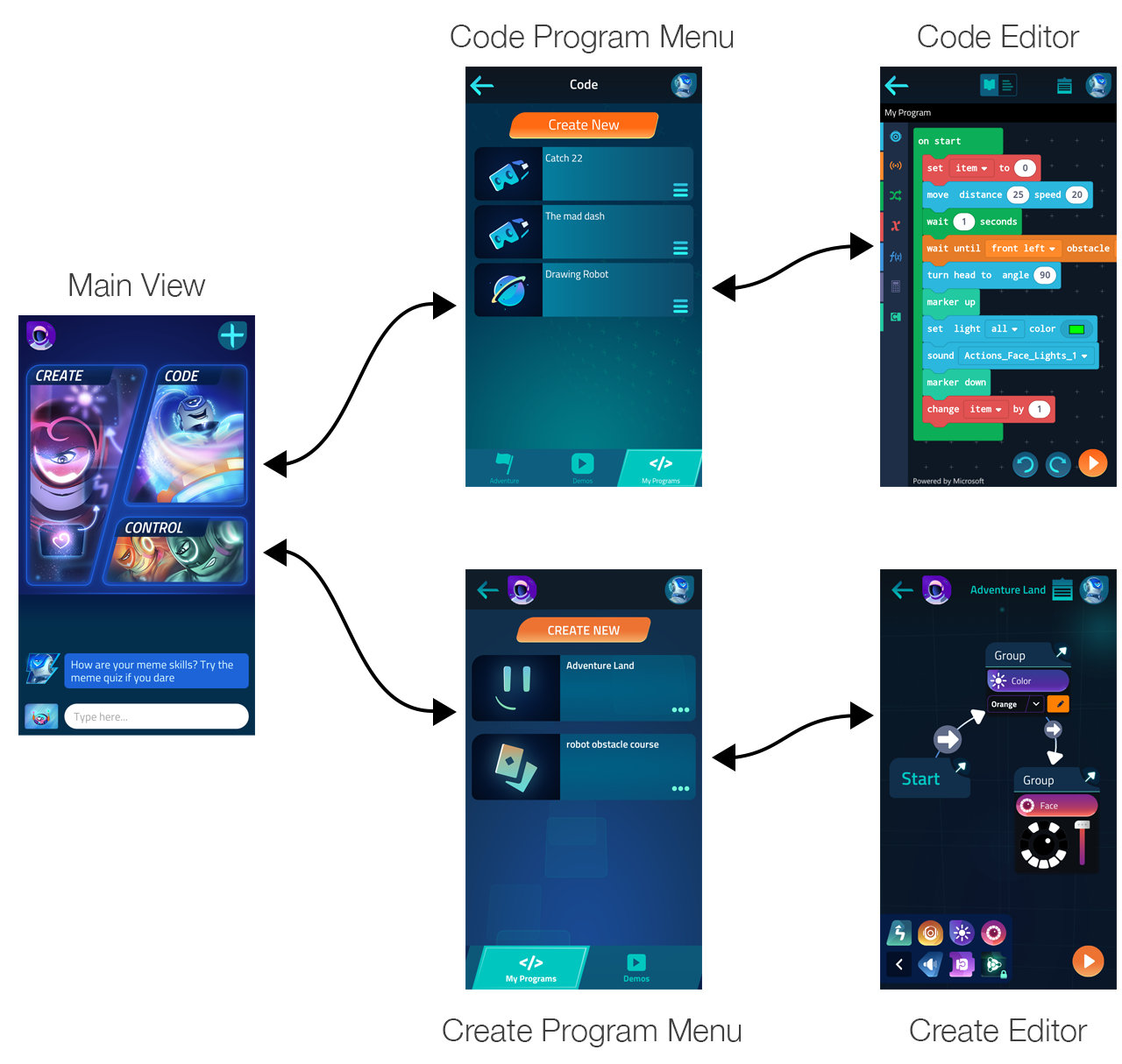
Cue mobile app flow requires navigation to and from the main menu.
Goals
• Create a solution that quickly allows teachers to start a class and jump right to the content.
• Improve the cohesiveness of the two coding paradigms. Creating a content system that better bridges the two and is easily accessible from either editor will greatly improve the experience.
Difficulties encountered
The main difficulties encountered were technical as this product needed to share a code base with the Cue home product and we had about 6 months to create the app with two engineers.
Solutions
Header based navigation
A persistent top navigation allows for easy navigation within and across both coding paradigms. There is never a need to return to the home page. All content is never more than 3 clicks away.
Redesigned flow
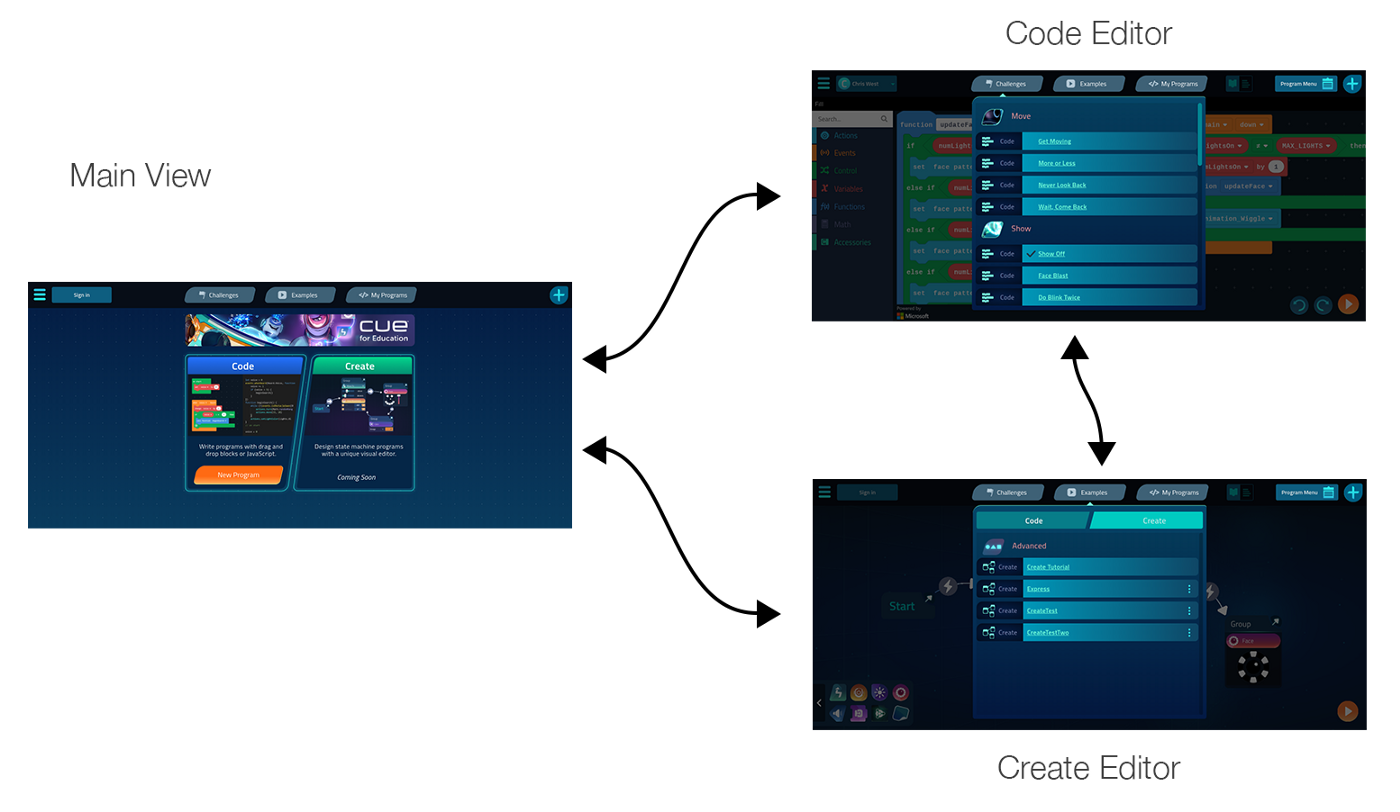
Cue Edu app flow allows easy navigation between editors and across all content categories.
Redesigned flow demo
Navigating and switching programs from Code to Create.
Accounts
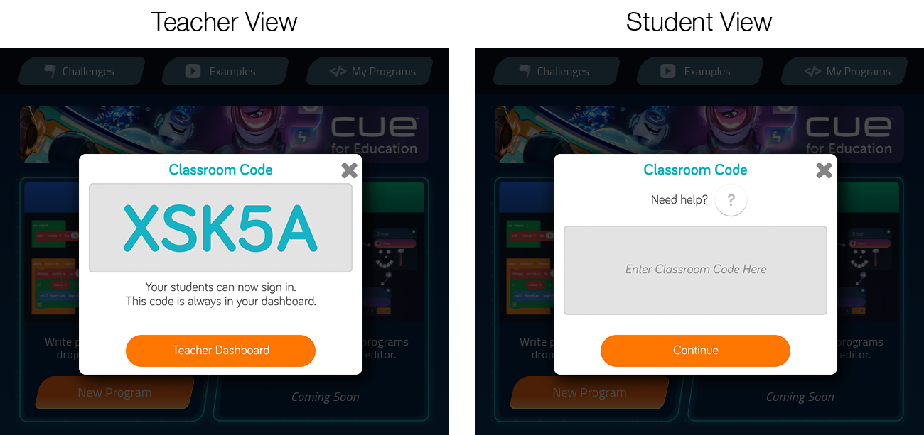
• Teachers can create an account using a Microsoft or Google sign in. Once their account created, a classroom code is generated for them to provide the students.
• Student accounts use the same methods of authentication but require a classroom code to finalize the account creation (In order to link the student to the teacher & also for legal requirements).
Locked Content
We worked with members from the educational content team to rebuild a solution that would allow teachers to easily navigate to the coding concepts that their are interested in. Below you will see to the left the gated progression content in Cue Home and to the right is the new open content system for schools.
Replayable Tutorials
We made sure that the initial onboarding ux and coding tutorials were both skippable and replayable. Students were sharing devices and therefore they need to be able to easily re-experience the introductions. When a user skips the tutorial we simply inform them on how to get back to it later.
Product Outcome
Despite the fact that the 2.0 version is live as of today, we are still working on this product. A lot of attention to detail needs to be added, simple interactions are still missing but we are trying our best to grow the team in order to address issues more quickly. Being a school based product it will be adopted for the next school year. We are looking to getting lots of feedback from teachers during the ISTE conference in June 2018 and hoping to further ameliorate the UX.
View this article on Medium
