Blockly profiles for device sharing
- Platform: iOS & Android
- Android: Google Play
- iOS: App Store
Overview
It’s official! After getting much feedback from our community of creators using Blockly both in schools and at home, we at Wonder Workshop have answered with the top feature request. Our Blockly V2.11.0 app now offers user profiles!
For about three months a team composed of an artist, product manager, an outsourced developer team in the Ukraine and myself (UX & UI) worked towards this product update.
The Brief
Audience
Children, Teachers, Parents
Our audience spans users at home & schools where multiple students need to share a device. The app is used by children 6–10yo in elementary schools and homes. The vast majority of our users are using tablets.
Feedback/Problem to solve
Here is some of the feedback we have received;
“I do wish there was a way to log into the app to save the student’s place when doing the puzzles, but my students love it!”
“I have three kids and really wish I could create three profiles for them. It’s frustrating to have to share one for all.”
“Blockly is in desperate need of a better organizational system for projects. We’ve had a number of projects deleted because they came up automatically at start up and a younger student erased by accident rather than close the project.”
Our users need a way to prevent overwriting each others projects and interfering with their puzzle progression.
Thoughts & Considerations
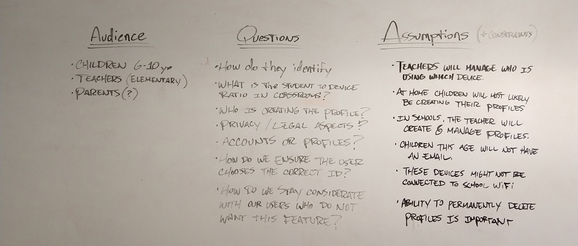
Additionally
• Child privacy must be respected. Do not encourage user to enter any personal information. However do not prevent them either (it might be necessary to more easily allow user to identify themselves).
• How do we deal with users who already have the app and therefore existing projects and content progression?
• This feature will need its copy translated into 5 languages.
Goals
Here are some of the highest level objectives I had for the product.
• Provide a fun way for children to identify their workspace. Conserve the fun narrative driven by the robot.
• Allow users to easily enter their workspace.
• Allow users to quickly know which profile is currently loaded.
Research
I had two methods for research at my disposition for this work:
• App metrics
• The company outreach team who is in contact with teachers.
Learnings & Data
• In classrooms, devices are shared between 4–5 students at most.
• Some of the younger students are not yet very keen at reading and writing.
• 80% of users are on tablets, home & schools combined(that number is much higher in schools).
• 85% of devices are iOS based.
• The feature request is also originated from after school robotics clubs.
• Some teachers want to be able to use the first name of the student as their profile identifier.
Brainstorming additional details after collecting user feedback/data
What are the building blocks of a profile system?
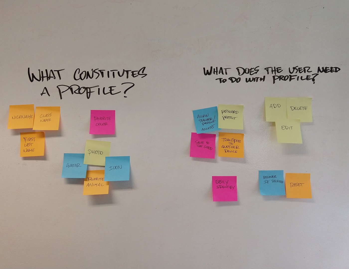
Solutions
A glimpse at the flow and some wireframes.
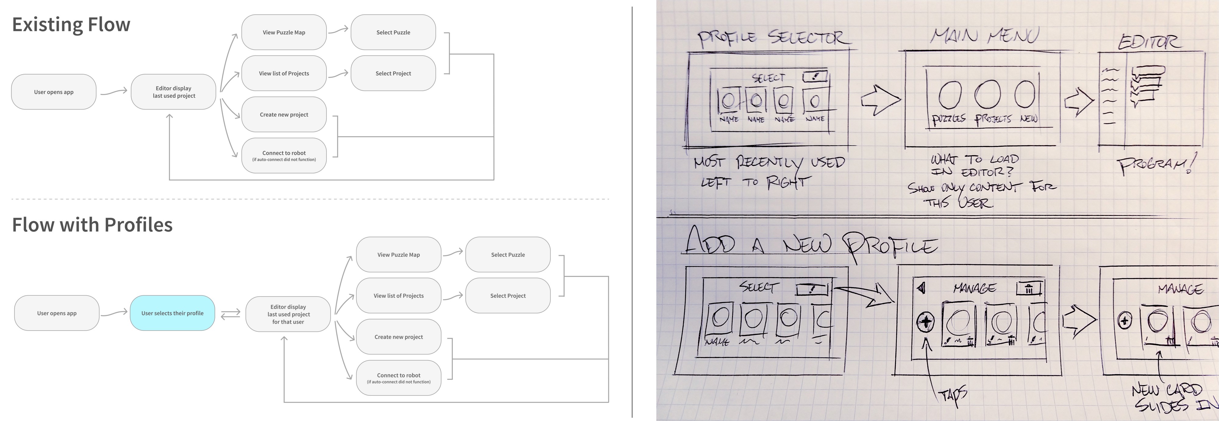
UI design work in Figma.
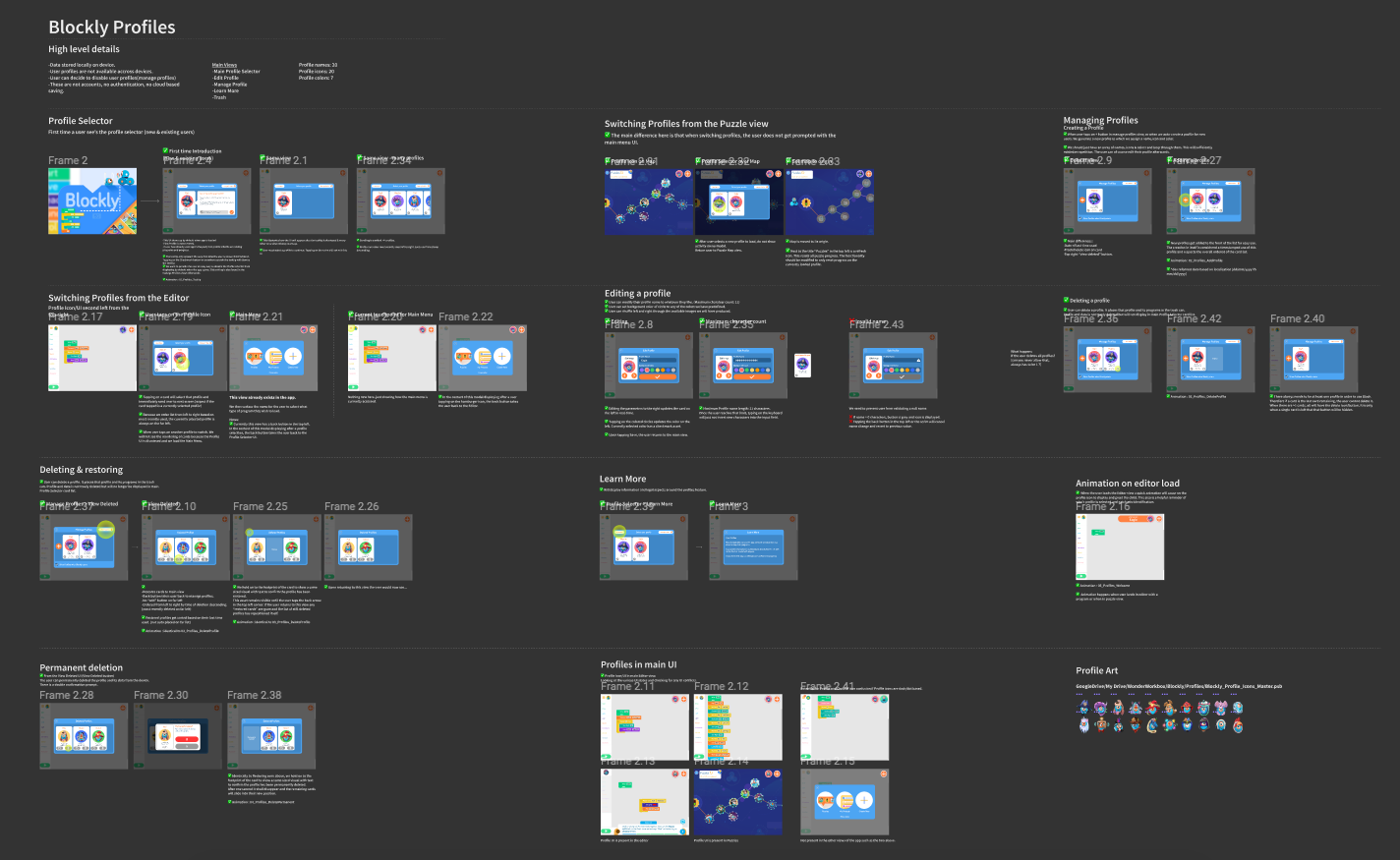
Key Screens
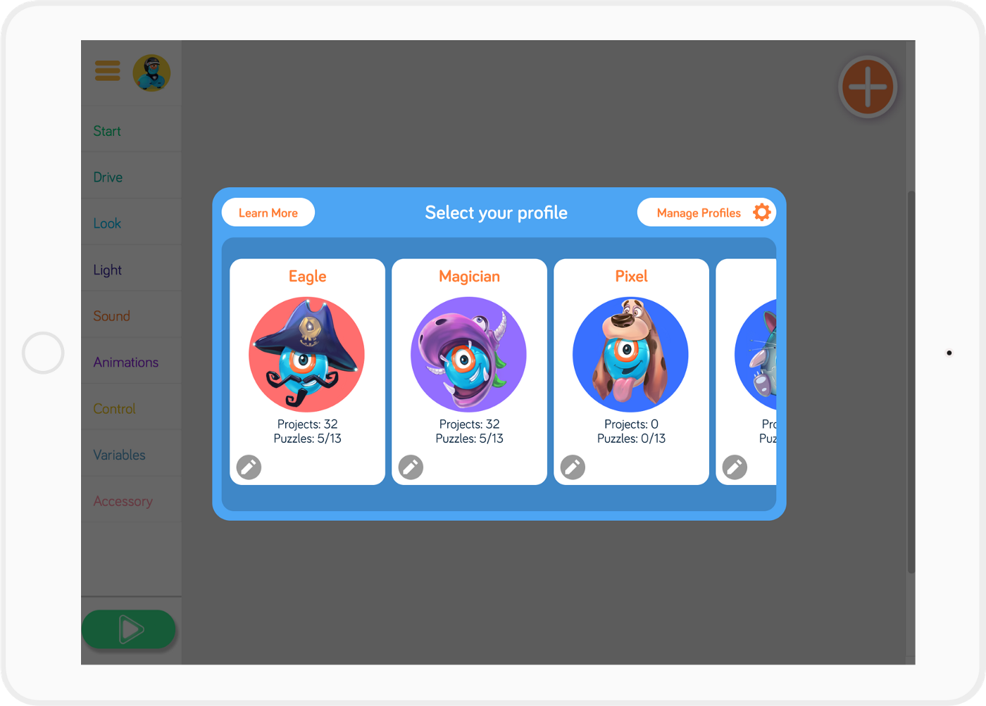
Main Profile Selector
This view will display when the app opens. It ensures that the user knows who’s content will be loaded.
Several pieces of information help users identify their card: name, avatar, color, puzzle progression, quantity of projects.
The cards are also ordered by most recently used which allows minimized effort for frequent.
First Time Introduction
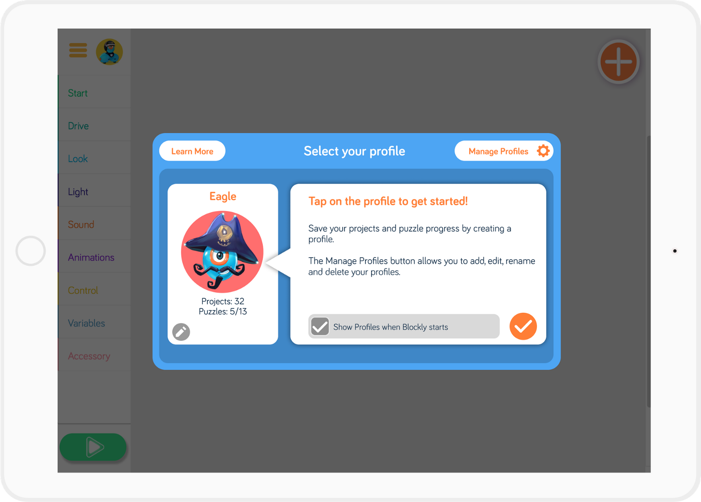
New and existing users coming back for the first time after the app upgrade will see a quick introduction to profiles. A first profile is automatically created. For existing users, all projects and puzzle progression have been associated with this first profile.
For our single user audience, this is also an opportunity for them to decide not to see the profile selector every time the app loads.
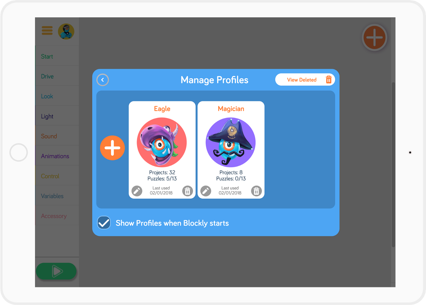
Managing Profiles
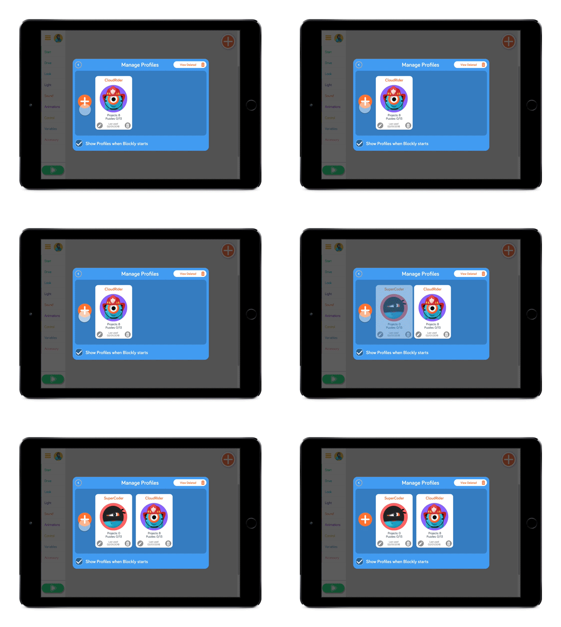
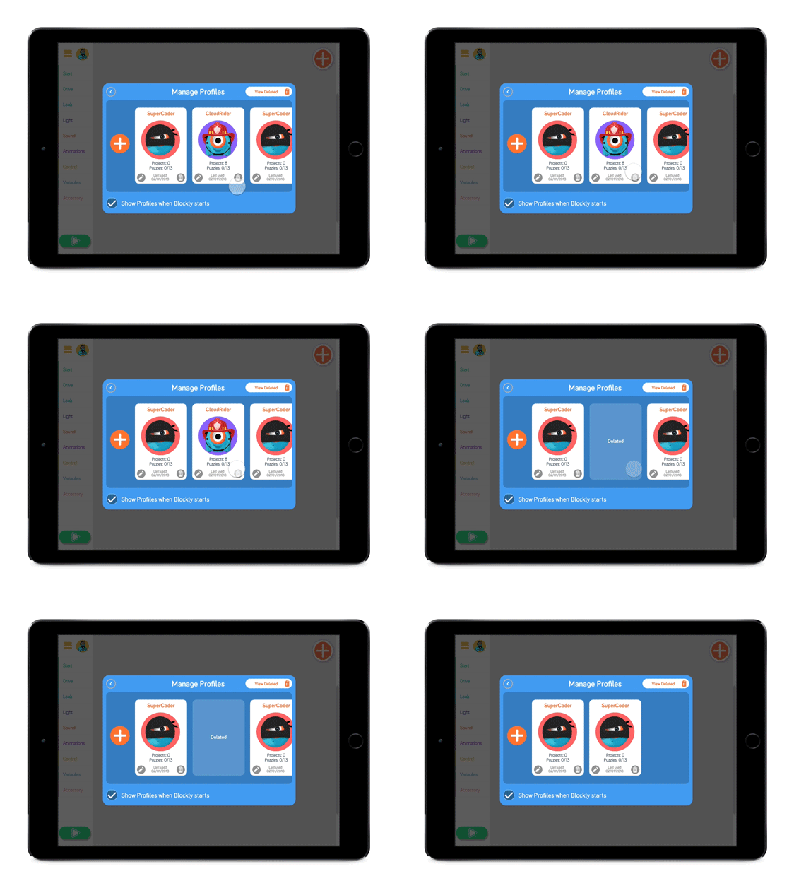
The user can add, edit & delete profiles. Because children can also get to this interface, I made deletion a two step process, equivalent to how it works on Mac or Windows. Deleted profiles first go to a trash bin where they can be recovered or permanently deleted.
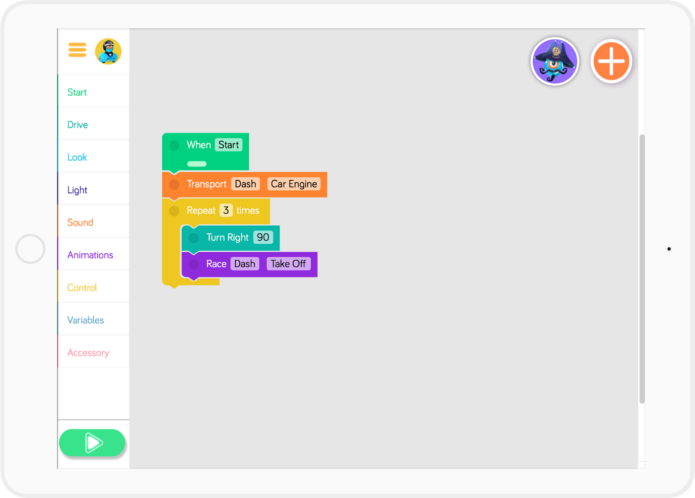
Main Editor
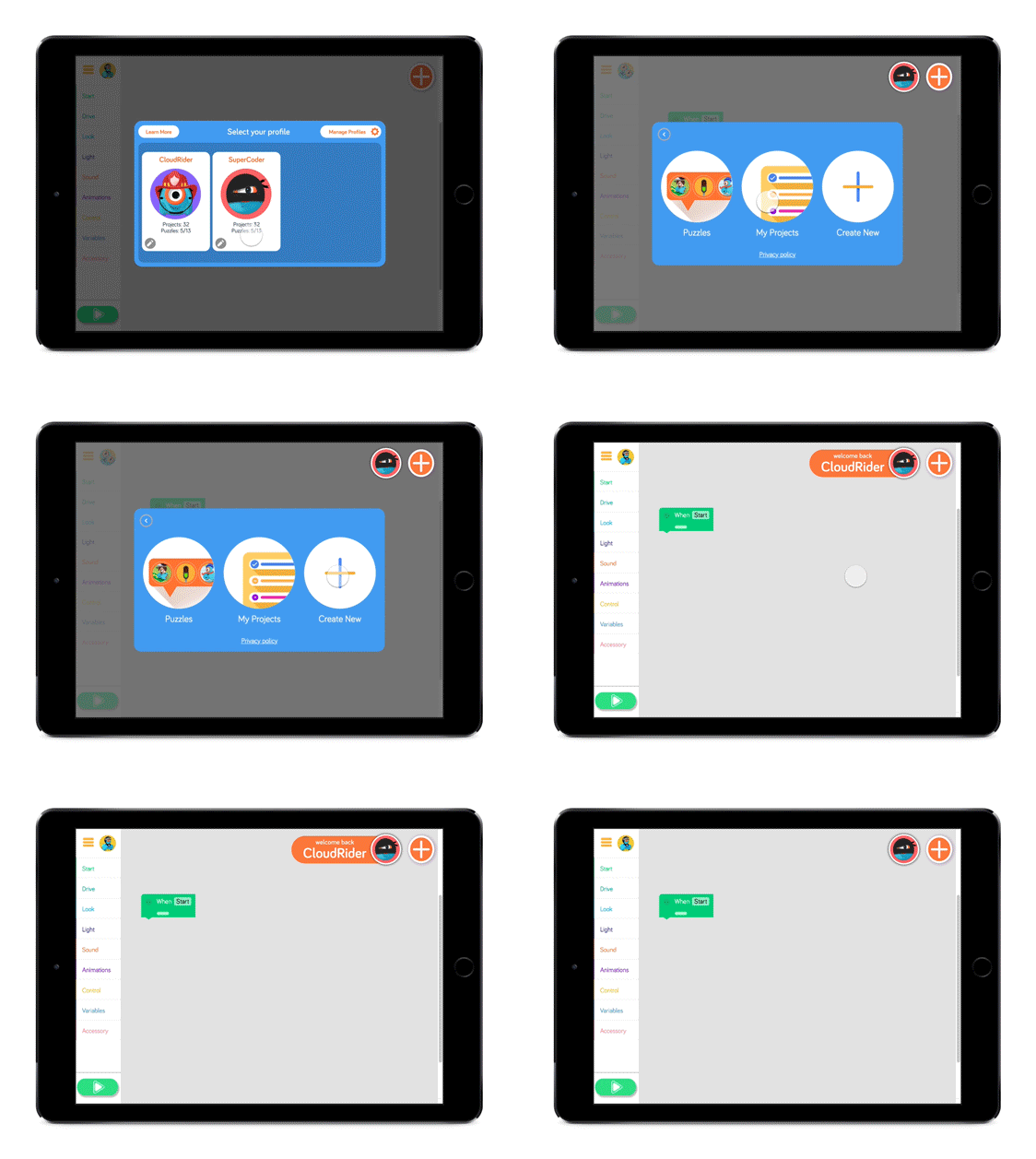
In the upper right of the editor screen we have a reminder of which profile is loaded. This is also the touchpoint to access the profile selector and all its functionality.
Using transitions to better communicate
Here are some of the animations that were created to augment cognition of what was occuring.
Adding a new profile.
Selecting a profile. Greeting and confirmation of profile in main editor.
Profile deletion.
Feedback
It has only been a month since we released this new feature. We have yet to get a large quantity of constructive feedback from our user base but through some user testing we have noticed that we can further improve visual feedback about which profile has been selected in both the profile selector and the main menu.
Here are some screen captures from feedback I was to find on Twitter and the Google play store.


